Alex Turner
Case Study:
Reinventing online banking


Introduction
At the UX Design Institute, I was given the brief to make a banking UI that is trustworthy, clear and playful. I needed to make three screens for a mobile app, a tablet and a web screen.
Playful
Clear
Trustworthy
Functional
I want to create a design that has fun aspects, a banking app needs to feel friendly and not intimidating. Soft shapes and fun colours will be used to achieve this.
Clarity is extremely important for ensuring users understand how to access important information regarding their money with no confusion. An interface that is too fancy and complicated will generate a bad reputation with the brand. Clarity will be achieved by using clear fonts, contracting colours, simple layouts and recognisable design systems.
Trusting a brand with money can be scary. This is why it is vital to create a secure UI. Security can be achieved via maintaining a consistent design that feels safe. Elements that allow privacy and security settings, including iconography (such as locks) to signal the status of the accounts. The login process should be vigorous and often.
Of course, any UI needs to be functional. Frequent feedback and tests need to considered. The system needs to be able to display finances in multiple accounts, a spending page, the ability to transfer money, and account details.
My Design Goals
Process Summary
01
Research
The first step was to research. I started by surveying competitor banking apps. I then created mood-boards that featured the three fundamentals: trustworthy, clear and playful. These mood-boards were then shown to the 'client' along with some rough ideas in order to ensure my vision aligned with theirs. After receiving feedback I moved onto phase 02.
02
Wireframing
With the help of the rough sketches from my feedback I was able to design some low-fidelity wireframes outlining the basic design, using Figma, still keeping in mind the fundamentals of the brief and crucial design principles.
When I was happy with these very basic wireframes I began to create some mid-fidelity wireframes. During this process alignment grids were added and exact measurements were used for a more consistent appearance. Some slight branding was also included.
Once alignment was finessed and some slight feedback was gathered I moved onto creating my final wireframes - high fidelity.
This is were a brand kit was built. I asked for further 'client' feedback before presenting my final screen designs.
03
Presenting & Prototyping
Finally, with my final screens (9 in total) finalized I exported the files and was able to show and present my designs. I was able to rationally explain all my decisions. The brief did not call for any prototypes, however for my own personal learning I was able to explore this feature on Figma and gain I pretty good understanding of how the apps would possibly interact.
Early Ideas
I always start on paper to get my ideas flowing with no limitations!
I start with designing the mobile UI. I enlarge and edit the design for tablet and desktop UI in the digital wireframe stage. This helps with continuity and creating responsive design.


'My accounts' screen first ideas
'My spending' screen first ideas
Taking it to Figma
wireframes
01 My Accounts Screen - low fidelity


02 Current Account Screen - low fidelity


03 My Spending Screen - low fidelity


Brand Kit
The brand kit was constructed with careful consideration keeping in mind my design goals and the brief.

The colour palette has been assessed to abide with accessibility standards which I felt was highly important and adds to the level of professionalism.
The Lykewise purple acts as a recognizable colour for the brand identity. I had not seen it used in competitor brands.
I created the logo as a simple but recognizable badge vital for a good brand identity. It needed to reflect the playful yet trustworthy traits of the brand.
Typography was kept simple and clear. Nunito Sans was chosen for lettered text - its clear and legible with a huge amount of flexibility. I did not want any confusion with user's information especially regarding something as important as their money and personal information. I wanted to chose a different font for numbers that appeared clearer on all the screens and found that Roboto worked very well for this and looked great beside Nunito Sans. Roboto has a slightly larger x height so stood out from the lettered text - this is beneficial for an app that values numerals ie. money.
Finalizing Designs
Iterations continued until I was able to finesse the early low fidelity wireframes into final UI designs.

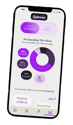
Clarity & Ease
My main focus was always to display the information a user is primarily looking for. In this case, the balance or the outgoings/incomings of the balance. Big eye-catching bubbles proved to be effective in showing the balance on all screens as the first element in the hierarchy, while adding to the playful side of the UI due to its fun colouring and rounded bubble shape. Use of colour was important for representing figures. Green and red are already associated with in and out in human psychology, this was then used to the UI's advantage to represent figures leaving and entering the account with ease. A user can see in an instant which is their outgoings and incomings.
Customability
To add a sense of control and an element not utilized by the competitors, I wanted to add the option to customise the user's My Spending page. I feel it is necessary to tailor the app to the individual way a person may be spending. The design shows an edit button that allows the user to pick which categories they want displayed in their spending data. Everything is categorised within said categories and the user should be able to customise which categories they want to see based on their own spending habits.
Seeing data from the user's day to day spending adds a new layer of clarity to the app.
Mobile to Tablet to Desktop
A responsive design.

Sizing Up
Mobile wireframes were converted to tablet and then desktop sized screens. I was proactive with solutions regarding utilising the extra space and change in the way a user may use the app.
Navigation was the biggest change from mobile/tablet app. A sleek side navigation menu was adopted for desktop. With the gained spaced all pages can be displayed, more pages could even be added to accommodate the future growth.
All the same important information is presented in the same way to ensure a feeling of safety and clarity. This also avoids the user having to relearn the app for their different devices.


